API Request Dashboard
Overview
The API Request Dashboard provides a comprehensive, real-time view of your entire API infrastructure. This dashboard aggregates metrics across all endpoints, offering a high-level overview of system health, performance, and traffic patterns. It's designed for daily operations monitoring, incident response, and capacity planning.
Key Features
- Real-time Monitoring: Live metrics updated continuously from Prometheus
- Aggregated View: System-wide metrics across all API endpoints
- Performance Tracking: Response time percentiles and averages
- Error Analysis: Detailed breakdown of client and server errors by status code
- Traffic Insights: Request rates, method distribution, and endpoint popularity
- Health Indicators: Success rates and error ratios for quick health assessment
Dashboard Structure
The dashboard is organized into four main sections:
- Summary Stats - Key metrics at a glance (6 stat panels)
- Traffic & Performance - Request rates and response time analysis (4 time-series panels)
- Errors & Status Codes - Error rate breakdowns and HTTP method analysis (3 time-series panels)
- Endpoint Analysis - Detailed endpoint-level metrics (3 time-series panels)
Summary Stats
The Summary Stats section provides six critical metrics for quick health assessment at the top of the dashboard.
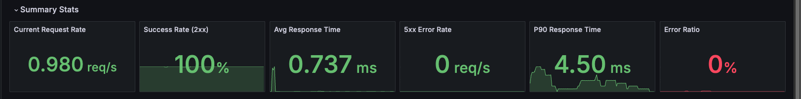
Current Request Rate
Description: Total requests per second across all API endpoints.
Metrics:
- Aggregated request rate (req/s)
- Real-time traffic volume indicator
Query:
sum(rate(http_server_duration_milliseconds_count{job="otel-collector", namespace="dynamoai"}[1m]))
Use Cases:
- Monitor overall API traffic volume
- Detect traffic spikes or unusual patterns
- Track traffic growth trends
- Identify potential traffic anomalies
Interpretation:
- Shows total request volume across all endpoints
- Compare with historical patterns to identify trends
- Monitor for sudden changes in traffic patterns
Success Rate (2xx)
Description: Percentage of requests that return successful HTTP 2xx status codes.
Metrics:
- Success rate as a percentage (0-100%)
- Calculated from 2xx responses vs total responses
Query:
(sum(rate(http_server_duration_milliseconds_count{status=~"2..", job="otel-collector", namespace="dynamoai"}[1m])) / clamp_min(sum(rate(http_server_duration_milliseconds_count{job="otel-collector", namespace="dynamoai"}[1m])), 0.0001)) * 100
Use Cases:
- Quick health check indicator
- Monitor API reliability
- Track service quality trends
- Assess overall system health
Interpretation:
- Higher values indicate better API reliability
- Typical values range from 95-100% for healthy APIs
- Compare with historical baselines to identify trends
Avg Response Time
Description: Average response time in milliseconds across all API requests.
Metrics:
- Mean response time (ms)
- Aggregated across all endpoints and methods
Query:
sum(rate(http_server_duration_milliseconds_sum{job="otel-collector", namespace="dynamoai"}[1m])) / sum(rate(http_server_duration_milliseconds_count{job="otel-collector", namespace="dynamoai"}[1m]))
Use Cases:
- Track overall API performance
- Identify system-wide performance degradation
- Monitor performance trends over time
- Baseline for performance optimization
Interpretation:
- Lower values indicate better performance
- Compare with P90 and other percentiles to understand distribution
- Track trends over time to identify performance changes
5xx Error Rate
Description: Rate of HTTP 5xx server errors per second.
Metrics:
- Server error rate (req/s)
- Includes all 5xx status codes (500, 502, 503, 504, etc.)
Query:
sum(rate(http_server_duration_milliseconds_count{status=~"5..", job="otel-collector", namespace="dynamoai"}[1m]))
Use Cases:
- Quickly identify server error spikes
- Monitor system stability
- Track server error trends
- Identify infrastructure issues
Interpretation:
- Lower values indicate better system stability
- Zero or near-zero values are typical for healthy systems
- Monitor for sustained non-zero rates
P90 Response Time
Description: 90th percentile response time in milliseconds.
Metrics:
- P90 latency (ms)
- 90% of requests complete within this time
Query:
histogram_quantile(0.90, sum by(le) (rate(http_server_duration_milliseconds_bucket{job="otel-collector", namespace="dynamoai"}[5m])))
Use Cases:
- Understand tail latency
- Identify performance outliers
- Better performance indicator than average (less affected by outliers)
- Track latency distribution
Interpretation:
- P90 is typically 2-3x the average response time for healthy systems
- Compare with average response time to understand variance
- Higher P90 values indicate more variable performance
Error Ratio
Description: Percentage of requests that result in 4xx or 5xx error status codes.
Metrics:
- Error ratio as a percentage (0-100%)
- Includes both client errors (4xx) and server errors (5xx)
Query:
(sum(rate(http_server_duration_milliseconds_count{status=~"[45]..", job="otel-collector", namespace="dynamoai"}[1m])) / sum(rate(http_server_duration_milliseconds_count{job="otel-collector", namespace="dynamoai"}[1m]))) * 100
Use Cases:
- Monitor overall error rate across the API
- Track system reliability
- Identify periods of degraded service
- Quick health indicator
Interpretation:
- Lower values indicate better system reliability
- Typical values are under 5% for healthy APIs
- Compare with Success Rate (they should sum to approximately 100%)
Traffic & Performance
This section provides detailed time-series analysis of traffic patterns and performance metrics.
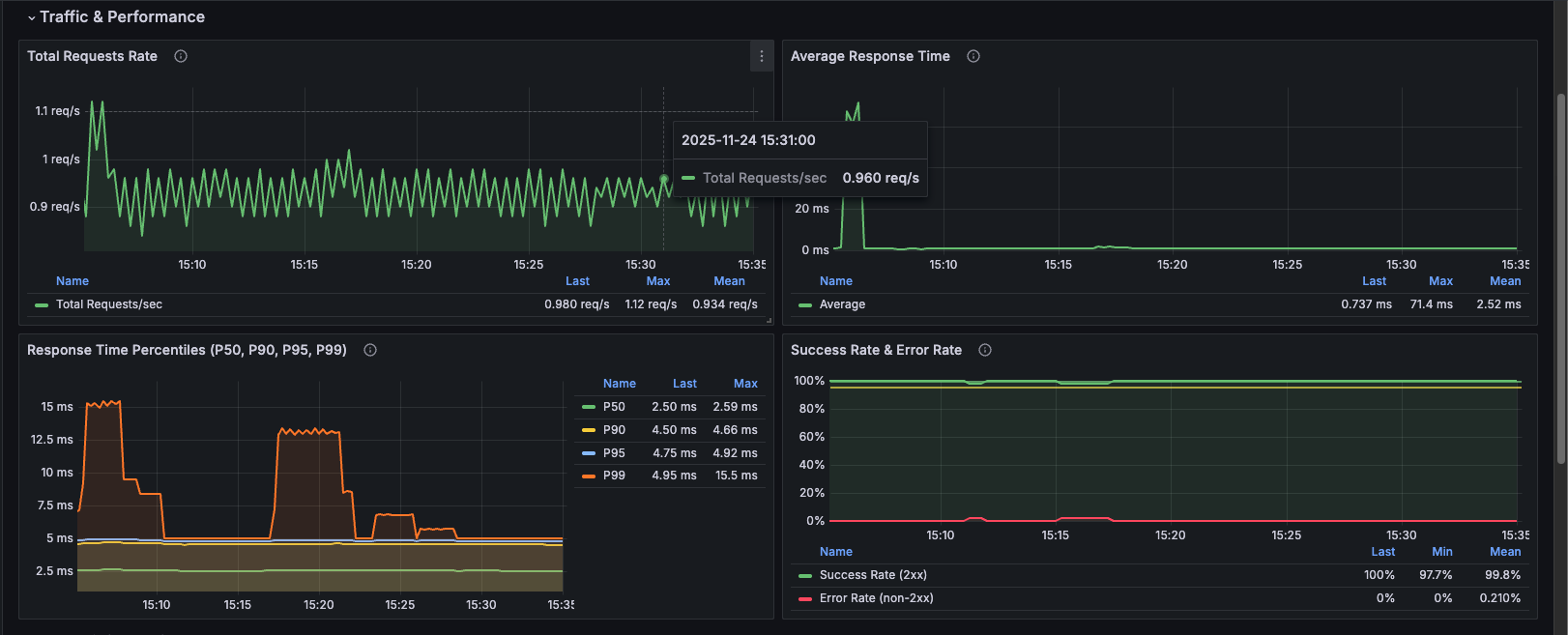
Total Requests Rate
Description: Time-series graph showing the aggregate rate of requests per second across all API endpoints over time.
Metrics:
- Requests per second (req/s)
- Historical trend visualization
Query:
sum(rate(http_server_duration_milliseconds_count{job="otel-collector", namespace="dynamoai"}[1m]))
Use Cases:
- Monitor traffic patterns throughout the day
- Identify traffic spikes and their timing
- Track traffic growth trends
- Correlate traffic with performance issues
- Capacity planning
Visualization: Line graph showing request rate over time
Average Response Time
Description: Time-series graph of average response time in milliseconds for all API requests.
Metrics:
- Average latency (ms)
- Historical performance trend
Query:
sum(rate(http_server_duration_milliseconds_sum{job="otel-collector", namespace="dynamoai"}[1m])) / sum(rate(http_server_duration_milliseconds_count{job="otel-collector", namespace="dynamoai"}[1m]))
Use Cases:
- Track performance trends over time
- Identify performance degradation periods
- Correlate with traffic spikes
- Monitor impact of deployments
- Baseline establishment
Visualization: Line graph showing average response time over time
Response Time Percentiles (P50, P90, P95, P99)
Description: Comprehensive latency distribution showing multiple percentiles simultaneously.
Metrics:
- P50 (Median): 50% of requests complete within this time
- P90: 90% of requests complete within this time
- P95: 95% of requests complete within this time
- P99: 99% of requests complete within this time
Queries:
# P50
histogram_quantile(0.50, sum by(le) (rate(http_server_duration_milliseconds_bucket{job="otel-collector", namespace="dynamoai"}[5m])))

# P90
histogram_quantile(0.90, sum by(le) (rate(http_server_duration_milliseconds_bucket{job="otel-collector", namespace="dynamoai"}[5m])))

# P95
histogram_quantile(0.95, sum by(le) (rate(http_server_duration_milliseconds_bucket{job="otel-collector", namespace="dynamoai"}[5m])))

# P99
histogram_quantile(0.99, sum by(le) (rate(http_server_duration_milliseconds_bucket{job="otel-collector", namespace="dynamoai"}[5m])))
Use Cases:
- Understand latency distribution
- Identify tail latency issues
- Compare different percentiles to understand variance
- Track latency distribution changes over time
- Performance optimization targeting
Visualization: Multi-line graph with four series (P50, P90, P95, P99)
Interpretation:
- P50 should be close to average response time
- P90 typically 2-3x P50
- P95 typically 3-5x P50
- P99 typically 5-10x P50
- Large gaps between percentiles indicate high variance
Success Rate & Error Rate
Description: Combined view showing both success rate (2xx responses) and error rate (non-2xx responses) as percentages, ensuring they always sum to 100%.
Metrics:
- Success Rate: Percentage of 2xx responses
- Error Rate: Percentage of non-2xx responses (calculated as 100% - Success Rate)
Queries:
# Success Rate
(sum(rate(http_server_duration_milliseconds_count{status=~"2..", job="otel-collector", namespace="dynamoai"}[1m])) / clamp_min(sum(rate(http_server_duration_milliseconds_count{job="otel-collector", namespace="dynamoai"}[1m])), 0.0001)) * 100

# Error Rate (using negation)
100 - ((sum(rate(http_server_duration_milliseconds_count{status=~"2..", job="otel-collector", namespace="dynamoai"}[1m])) / clamp_min(sum(rate(http_server_duration_milliseconds_count{job="otel-collector", namespace="dynamoai"}[1m])), 0.0001)) * 100)
Use Cases:
- Monitor API reliability trends
- Track success and error rates simultaneously
- Identify periods of degraded service
- Quick health assessment
Visualization: Two-line graph with success rate (green) and error rate (red)
Key Feature: Error rate is calculated using negation (100% - success rate), ensuring:
- Always sums to 100% with success rate
- Includes all non-2xx status codes (1xx, 3xx, 4xx, 5xx)
- More accurate than filtering specific error codes
Errors & Status Codes
This section provides detailed error analysis and HTTP method breakdowns.
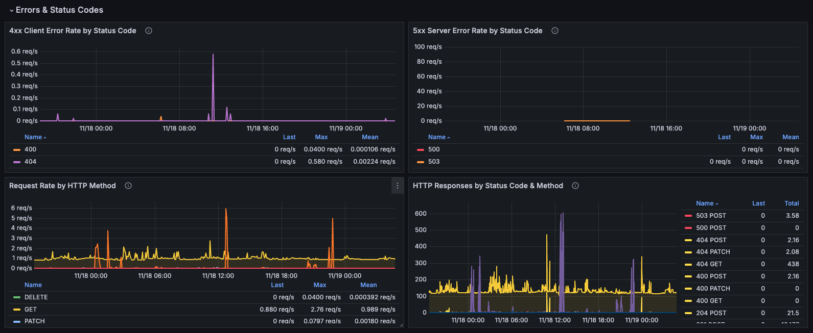
4xx Client Error Rate by Status Code
Description: Breakdown of client errors (4xx) showing the rate for each specific status code.
Metrics:
- Individual 4xx status code rates (400, 401, 403, 404, etc.)
- Rate per second for each status code
Query:
sum by (status) (rate(http_server_duration_milliseconds_count{status=~"4..", job="otel-collector", namespace="dynamoai"}[1m]))
Use Cases:
- Identify specific client error types
- Track authentication issues (401, 403)
- Monitor not found errors (404)
- Detect bad request patterns (400)
- Client-side issue diagnosis
Visualization: Multi-line graph with different colors for each status code
Common Status Codes:
- 400 Bad Request: Invalid request format
- 401 Unauthorized: Authentication required
- 403 Forbidden: Access denied
- 404 Not Found: Resource doesn't exist
5xx Server Error Rate by Status Code
Description: Breakdown of server errors (5xx) showing the rate for each specific status code.
Metrics:
- Individual 5xx status code rates (500, 502, 503, 504, etc.)
- Rate per second for each status code
Query:
sum by (status) (rate(http_server_duration_milliseconds_count{status=~"5..", job="otel-collector", namespace="dynamoai"}[1m]))
Use Cases:
- Identify specific server error types
- Track internal server errors (500)
- Monitor gateway errors (502, 503, 504)
- Server-side issue diagnosis
- Infrastructure problem detection
Visualization: Multi-line graph with different colors for each status code
Common Status Codes:
- 500 Internal Server Error: Application error
- 502 Bad Gateway: Upstream server error
- 503 Service Unavailable: Service overloaded or down
- 504 Gateway Timeout: Upstream timeout
Request Rate by HTTP Method
Description: Breakdown of request rate by HTTP method (GET, POST, PUT, DELETE, etc.).
Metrics:
- Request rate per second for each HTTP method
- Method distribution over time
Query:
sum by (method) (rate(http_server_duration_milliseconds_count{job="otel-collector", namespace="dynamoai"}[1m]))
Use Cases:
- Understand API usage patterns
- Identify which methods are most used
- Track method-specific traffic trends
- Capacity planning by method type
- Security monitoring (unusual method usage)
Visualization: Multi-line graph with different lines for each HTTP method
Common Methods:
- GET: Read operations
- POST: Create operations
- PUT: Update operations
- DELETE: Delete operations
- PATCH: Partial updates
HTTP Responses by Status Code & Method
Description: Total request count grouped by both HTTP status code and method, showing the distribution of responses.
Metrics:
- Total request count by status code and method combination
- Multiple series (e.g., "200 GET", "404 GET", "500 POST")
Query:
sum by (status,method) (increase(http_server_duration_milliseconds_count{job="otel-collector", namespace="dynamoai"}[$__rate_interval]))
Use Cases:
- Understand response distribution
- Identify which methods have the most errors
- Track status code trends by method
- Method-specific error analysis
- API usage pattern analysis
Visualization: Multi-line graph with color coding:
- 4xx errors: Yellow
- 5xx errors: Red
- 2xx responses: Green (default)
Endpoint Analysis
This section provides detailed endpoint-level metrics for deeper analysis.
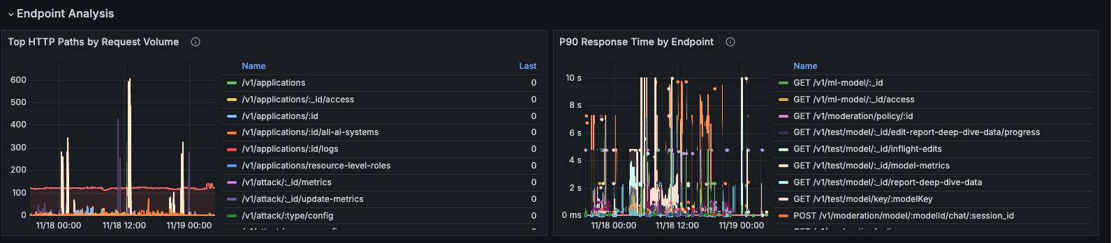
P90 Response Time by Endpoint
Description: 90th percentile response time broken down by individual endpoint (method and path combination).
Metrics:
- P90 latency per endpoint
- Endpoint identification (method + path)
Query:
histogram_quantile(0.9, sum by(le, method, path) (rate(http_server_duration_milliseconds_bucket{job="otel-collector", namespace="dynamoai"}[5m])))
Use Cases:
- Identify slow endpoints
- Compare performance across endpoints
- Find endpoints that need optimization
- Prioritize optimization efforts
- Track endpoint performance over time
Visualization: Multi-line graph with one line per endpoint
Best Practices:
- Sort by max value to find worst performers
- Focus on high-traffic, slow endpoints first
- Look for endpoints with consistently high P90
Top HTTP Paths by Request Volume
Description: Most frequently accessed API paths, ranked by total request volume.
Metrics:
- Total request count per path
- Sorted by volume (highest first)
Query:
sum by (path) (increase(http_server_duration_milliseconds_count{job="otel-collector", namespace="dynamoai"}[$__rate_interval]))
Use Cases:
- Identify most popular endpoints
- Understand API usage patterns
- Prioritize optimization based on traffic
- Capacity planning for high-traffic endpoints
- Identify endpoints that need scaling
Visualization: Multi-line graph with one line per path, sorted by total volume
Best Practices:
- Focus optimization on top 10-20 paths
- Monitor for sudden changes in path popularity
- Use for capacity planning
Use Cases
Daily Operations Monitoring
Routine Health Checks
Use this dashboard daily to:
- Quick Health Assessment: Review Summary Stats for immediate health indicators
- Traffic Monitoring: Check Total Requests Rate for normal patterns
- Performance Check: Verify Average Response Time and P90 are within expected ranges
- Error Review: Review Success Rate and Error Ratio
- Spot Check: Review 4xx and 5xx error rates for any anomalies
Incident Response
When Responding to Incidents
-
Start with Summary Stats:
- Check Success Rate and Error Ratio for immediate health assessment
- Review 5xx Error Rate for server issues
- Check Average Response Time for performance degradation
-
Analyze Error Patterns:
- Review 4xx Client Error Rate by Status Code for client-side issues
- Review 5xx Server Error Rate by Status Code for server-side issues
-
Identify Affected Endpoints:
- Use P90 Response Time by Endpoint to find slow endpoints
- Check Top HTTP Paths to see if high-traffic endpoints are affected
-
Correlate with Traffic:
- Review Total Requests Rate for traffic spikes
- Check if errors correlate with traffic increases
-
Track Resolution:
- Monitor Success Rate & Error Rate panel to see if issues are resolving
- Watch Response Time Percentiles for performance recovery
Capacity Planning
Planning for Growth
Use this dashboard to:
- Traffic Trends: Monitor Total Requests Rate over weeks/months to predict capacity needs
- Performance Baseline: Track Average Response Time and percentiles to identify when scaling is needed
- Endpoint Prioritization: Use Top HTTP Paths to identify which endpoints need optimization or scaling first
- Method Analysis: Review Request Rate by HTTP Method to understand resource needs by operation type
Key Metrics for Capacity Planning:
- Traffic growth rate (from Total Requests Rate)
- Performance trends (from Response Time Percentiles)
- High-traffic endpoints (from Top HTTP Paths)
- Error rate trends (from Success Rate & Error Rate)
Performance Optimization
Identifying Optimization Opportunities
-
Find Slow Endpoints:
- Use P90 Response Time by Endpoint to identify endpoints with high latency
- Focus on endpoints with consistently high P90 values
-
Prioritize by Traffic:
- Cross-reference slow endpoints with Top HTTP Paths
- Optimize high-traffic, slow endpoints first for maximum impact
-
Analyze Error Patterns:
- Review 4xx and 5xx error rates by status code
- Address endpoints with high error rates
- Check if errors correlate with performance issues
-
Monitor Improvements:
- Track Response Time Percentiles to measure optimization impact
- Monitor Success Rate & Error Rate to ensure optimizations don't introduce errors
How to Use
Time Range Selection
The dashboard supports flexible time range selection:
- Default: Last 30 minutes
- Real-time Monitoring: Last 15-30 minutes
- Daily Review: Last 24 hours
- Weekly Analysis: Last 7 days
- Trend Analysis: Last 30 days
- Historical Analysis: Custom ranges up to available data retention
Use the time picker in the top-right corner to adjust the time range.
Interpreting Metrics
Request Rates
- Monitor for consistent patterns matching expected traffic
- Compare with historical data to identify trends
- Look for sudden changes that may indicate issues
Response Times
- Average Response Time: Mean latency across all requests
- P90 Response Time: 90% of requests complete within this time
- Percentiles: Compare P50, P90, P95, P99 to understand latency distribution
- P90 is typically 2-3x average for healthy systems
Success and Error Rates
- Success Rate (2xx): Percentage of successful requests
- Error Ratio (4xx + 5xx): Percentage of error requests
- These should sum to approximately 100% (accounting for 1xx and 3xx responses)
- Monitor trends over time rather than absolute values
Navigation Workflow
Recommended Workflow:
- Start Here: Review Summary Stats for quick health check
- Deep Dive: Use Traffic & Performance section for detailed analysis
- Error Analysis: Review Errors & Status Codes section when issues are detected
- Endpoint Investigation: Use Endpoint Analysis section to identify specific problematic endpoints
Technical Details
Metric Details
All metrics are collected via OpenTelemetry instrumentation using nestjs-otel:
Histogram Metrics (for response times):
http_server_duration_milliseconds_sum: Total duration sumhttp_server_duration_milliseconds_count: Total request counthttp_server_duration_milliseconds_bucket: Histogram buckets for percentiles
Labels Available:
method: HTTP method (GET, POST, PUT, DELETE, etc.)path: API endpoint pathstatus: HTTP status codenamespace: Kubernetes namespace (dynamoai)job: Prometheus job label (otel-collector)podName: Pod name (when available)component: Component identifier (when available)
Update Frequency
- Real-time: Metrics update based on Prometheus scrape interval (typically 15-30 seconds)
- Panel Refresh: Dashboard refreshes automatically based on time range
- Query Intervals: Most queries use 1-minute rate calculations (
[1m]) - Percentile Queries: Use 5-minute windows (
[5m]) for more stable percentile calculations
Aggregation
- Summary Stats: Aggregated across all endpoints, methods, and paths
- Time Series Panels: Aggregated by selected dimensions (status, method, path, etc.)
- Percentiles: Calculated using Prometheus
histogram_quantile()function - Rate Calculations: Use
rate()function with appropriate time windows
Metric Naming
The dashboard uses the following Prometheus metric naming convention:
- Duration metrics:
http_server_duration_milliseconds_*(with_millisecondssuffix) - All metrics filtered by
job="otel-collector"andnamespace="dynamoai"
Query Patterns
Common Query Patterns Used:
-
Rate Calculation:
rate(metric[1m]) -
Sum Aggregation:
sum(rate(metric[1m])) -
Group By:
sum by (label) (rate(metric[1m])) -
Percentile Calculation:
histogram_quantile(0.90, sum by(le) (rate(metric_bucket[5m]))) -
Division with Zero Protection:
(numerator / clamp_min(denominator, 0.0001)) * 100
Implementation Notes
Metric Selection
The dashboard primarily uses http_server_duration_milliseconds_count for request counting because:
- It has consistent labels (
namespace,component,podName) across all metrics - It's available from the same instrumentation source
- It provides accurate counts for completed requests
Note: While dedicated request counter metrics (http_server_request_count_requests_total) exist, they may have different label structures, making them less suitable for aggregation with other metrics in this dashboard.
Last Updated: [24/11/2025]